Blog: Wait, what was that? 27 Apr 2010
I knew from the very beginning that creating a webcomic imposes some restrictions. One is the immutability of content. Once it's published, it shall not be changed. Thus spoke the Lord.
Now, add in the fact that you need to release periodically. Even more, you must. That's actually the key point, if I ever learn to draw it will be thanks to being forced to do it :):
Thing is, I didn't have enough time to review and check the last page I published. Then the next day, it felt completely out of tone with the idea of the comic. So I committed a sin and changed it and it's very interesting to see that some people noticed, but of course most didn't until I pointed them to the change (Facebook power).
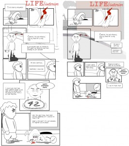
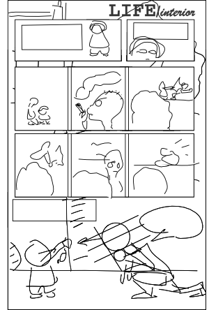
The actual changes I made are not so evident so the new version seemed better than the previous one although it was unclear why. Let me illustrate you with a Before and After comparison:
The most important bit is the text, previously it was too verbose, I must learn to leave some things for the reader to infer.
On a side note, Google Reader doesn't care about updated items --other feed readers will tell you there was an update, but someone at Google decided they didn't care, although updates are displayed correctly they are not marked as new content so it's easy to miss them.
BTW: I should change the stroke size for the characters at the bottom of the page, they look so horrible. Should I? Shouldn't? Where do I stop? HELP ME!
(more...)LIFE/interior: Childhood (3) 25 Apr 2010
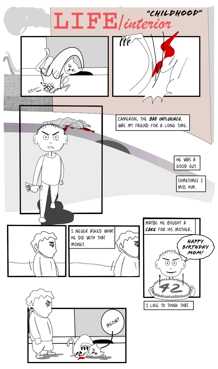
Well not so sure about this one, it could have used a bit more work, but I need to keep the story going or this will take forever.
I doubted about using 'mom' or 'mum'. The dictionary tells me that saying 'mum' is über-british and mom seems more international, so I went for international.
On another topic, I'm really wondering if I'm making the panels too big...
UPDATE: Changed quite a lot... removed all the silly text, changed the layout, reduced panels, added some background. I'll try not to do this too much, otherwise I'll keep changing all the drawings forever :).
Update: Rearranged text (again...).
Edit: Reformatted, changed font.
(more...)Blog: Cherchez la femme 20 Apr 2010
So I have this problem. Let's come clean. I can't draw women. I like to draw women in an androgynous way, I'm not too keen on drawing big voluptuous figures. Problem is, well, they are so androgynous that they are essentially indistinguishable from men.
So the solution is clear: add long hair, a ponytail or some earrings in order to provide clues, or combine it with a nice skirt. Women's Rights defenders will campaign against me soon. All that is good but limits my spectrum and sort of makes my drawings too stereotypical. Take this sketch as an example, that could easily come from a fairy tale. And I'm not sure why I used the manga eyes on it, btw. Ok, I was in a plane so the pressure changes may have affected my brain.
I have no trouble drawing really muscular guys, with impressive chests which easily border the homoerotic. I figure that's ok as long as I don't salivate while drawing them. Must be because I remember reading Savage Sword of Conan when I was growing. The fact that I seemed to focus on the muscular types and not the gorgeous women Conan was constantly saving may be worth a visit to the therapist.
In any case, what constitutes a girl's figure is very interesting, I have a few books on the subject, but I still need to practice quite a lot before I can introduce a female character. It's still going to be all boys for a few weeks. One of the books actually describes in detail how to draw women's breasts, with a whole chapter dedicated to 'women holding their breasts together by pressing them with their arms'. Let's hope it doesn't come to that.
(more...)LIFE/interior: Childhood (2) 18 Apr 2010
I'll misread volcano signals and continue stubbornly with my efforts to create, somehow, a webcomic that somebody would want to read.
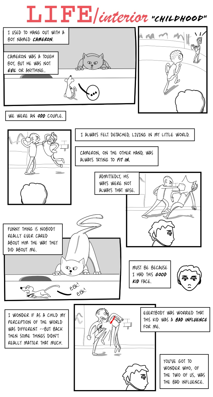
So here it is, a second page. Hopefully next one will be up earlier, as I already have some material for that.
(Update: fixed a typo in the word 'admittedly'... I really need to configure the spellchecker for Inkscape)
(Update: fixed a bit the text layout)
Edit: Reformatted, changed font.
(more...)Blog: On-the-go alternatives to scanners 10 Apr 2010
I've tried a few things that can replace a scanner. Let's share.
Since I only use the scanner for sketches and basic character traits, I don't really need that much precision but I do need it to be focused and not distorted.
1) iPhone photos. Crap. iPhone lacks a flash and is completely incapable of applying the right focus.
2) iSight camera from my rusty macbook. So-so, it has a pretend-flash and seems to be better at focusing, but it forces me to hold the paper at just the right distance.
3) Cheap Nikon Coolpix digital camera. Clear winner. Using the 'close-up' mode it seems to be able to focus perfectly on the drawings.
So 3 it is. All this effort is because it seems to be easier for me to outline a sketch using the ancient method of pencil and paper. See this example below, which had a threshold applied to make it black and white.
And I even used a movement line (the curved line that goes from top to bottom) to define the shape of the cat. I'm going pro.
(more...)LIFE/interior: Childhood (1) 04 Apr 2010
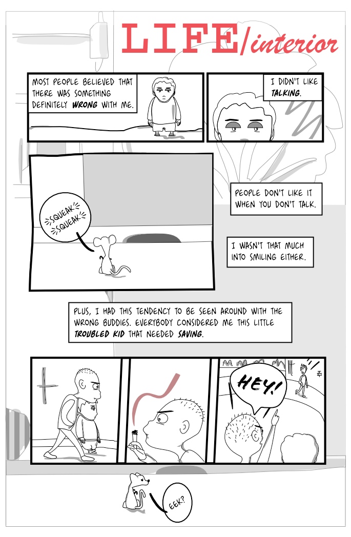
So, me being an illiterate foreigner, I didn't know what to use as a sort of onomatopoeia for the sounds the mouse was supposed to make. I resorted to asking a knowledgeable friend and her response is funny enough that I'll write it here: "Eek is typical of a scared mouse. Squeak is standard for all other mouse emotions or Hmm if it's a wondering mouse" (smiley faces omitted). English is such a wonderful language when it comes to sounds.
I changed my mind regarding the font used for the lettering, it doesn't seem to suit this script. Now it's YanksHand 18pt, 100% space, for the geeks out there. I'm also learning a bit more about Inkscape and starting to figure out just the right layer layout. Shading is now in a layer on top of the inking, using the magic 'Darken' blend mode. That little change allowed me to create shapes with a solid background which makes creating the figures easier sometimes.
Anyway, as promised, story starts to unfold and it follows an actual script. Yay!
Edit: Reformatted, changed font.
(more...)Blog: playing with proportions 01 Apr 2010
So I had a hard time choosing the right proportions for the character when he's older. The child is supposed to be funnier and intentionally disproportionated but the adult, even if it should also look like a cartoon character, should be a bit more proportional. So I started googling and found various techniques, the one applied here is based on the size of the head, essentially using it as a ruler. See the progress from sketch to draft below. Essentially, the body is 7 'heads' long. Trick is that whenever there's a joint, these 'heads' may overlap as in the knees below. Well, that's what I think...
Not so bad. I kind of like the style, pending adding detail, probably changing the pencil width, etc.
(more...)Blog: Now I'm really missing the scanner 31 Mar 2010
This is what I did yesterday. I tried doodling directly with the tablet, bypassing the usual pencil drawing and then scanning, because I don't have a scanner here. I did some basic hand drawing for inspiration, but changed it a bit when drawing on screen. The conclusion: I do need the scanner or drawing with a bigger zoom or something, because the results are quite disappointing:
The thing is that unless you are a the correct zoom level, most of the traces you draw with the table are not actually represented in the drawing, so when I quickly did the traces for the head of a mouse (that's what the child is supposed to be holding), all the detail disappeared. I'm posting it nonetheless, so that the world can see how that evolves to something :).
And I did draw the small child looking to the left, had to play a bit with guides in Inkscape to make it proportional, but it looks fine enough. Not sure about the hands, maybe I can make the character wear prosthetic hands because that is what they look like...
I like the expression it has. It's missing some shadows (one under the eye), but it's still a bit of a draft.
(more...)Blog: Drawing children 29 Mar 2010
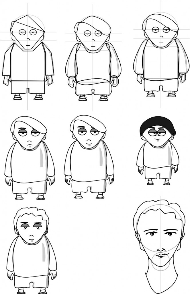
Well the next pages that hopefully will be coming during the following weeks are actually scripted, yes, like in a real comic! They describe our narrator's recollections from his childhood. I wanted to use a slightly different style for the 'childhood' era. I included the actual drawing process this time. Since I don't have my scanner here I didn't use the pencil draft, although I did create one. So process goes: I outlined the figure with straight lines, then smoothed them using Inkscape, then tweaked them, then continued tweaking and defining detail (while trying not to put too much detail in).
So yep, this is what I do on a weekend:
Actual main character is supposed to be the last white haired one, the black haired one is just me playing to see how tweaking distances in the figure can completely change the look of a character. My initial thought was that the child version of the main character should have a different hairstyle, because usually when you are a child it's your mom that decides how you look, but I think using the same hairstyle makes him easier to identify. I did want it to have distinct, more comic-like, eyes.
Tricky bit is now doing the same character in various positions...
(more...)Blog: New site layout drafts, UK Webcomix Thing 27 Mar 2010
Well my friend Sergi was kind enough to draft a design for this site. His approach is usually quite different to mine so that's always welcome.
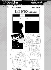
Here's what it looks like:
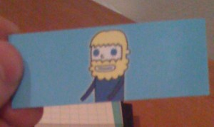
By the way, I enjoyed the UK Webcomix Thing 2010 today. Lots of talent there, I talked with quite a lot of people which were quite nice and I hope someday I myself will have something to show there too :). Lots of different styles, but I seem to prefer the somewhat cute ones, like Timothy Winchester, if only because of the business cards he was giving:
