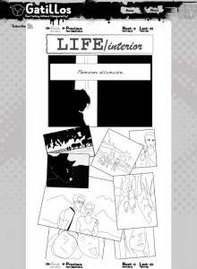
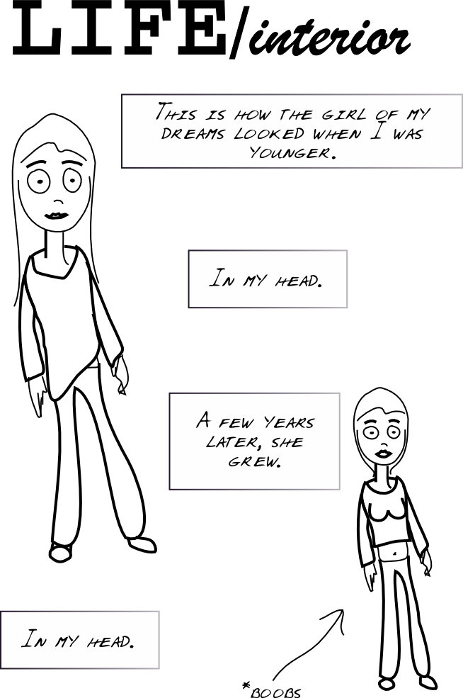
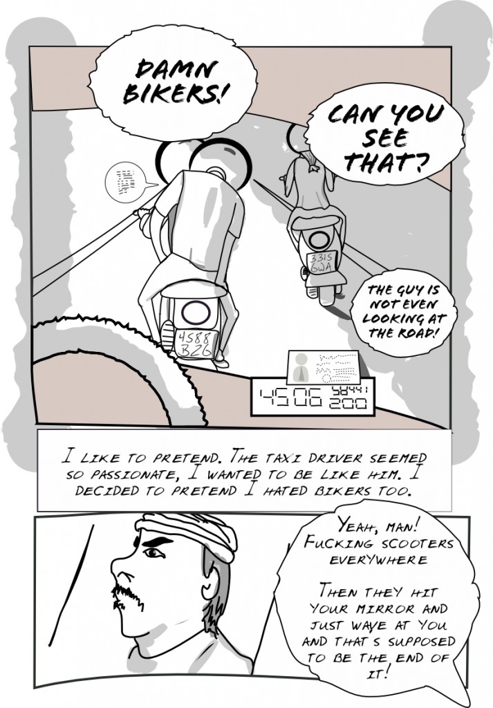
Well my friend Sergi was kind enough to draft a design for this site. His approach is usually quite different to mine so that’s always welcome.
Here’s what it looks like:
By the way, I enjoyed the UK Webcomix Thing 2010 today. Lots of talent there, I talked with quite a lot of people which were quite nice and I hope someday I myself will have something to show there too :). Lots of different styles, but I seem to prefer the somewhat cute ones, like Timothy Winchester, if only because of the business cards he was giving:
(more...)Site redesign... 2010-03-25
Well since I have some difficulties finding the right spot to draw, I’ll update the site putting it closer to the webcomic layout. I’m using a wordpress plugin called webcomic and the inkblot theme, no customizations yet.
I’ve been doing quite a lot of traveling lately (Dublin, London, Barcelona) and that’s seriously getting in the way, but I shall prevail!
Have defined the story and will start posting pages in an orderly manner, while also continuing with the blog. It’s part of the magic of the webcomic plugin.
(more...)More background story 2010-03-21
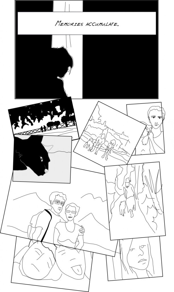
So I’m continuing with what could be thought of as the introduction. The narrator continues to present a bit of himself as a prelude to the story.
First panel is actually a rendition from a photograph from my friend Haripako (check it at his flickr page and take a look at the wonderful photographs he takes as part of his ongoing 365-day photo project, used here under permission :)). The rest are based on old photos I had around and some googling for inspiration.
(more...)First page for LIFE/interior 2010-03-19
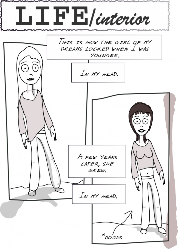
This is a slightly more polished version of the previous draft. I realigned the balloons to make it easier to follow and added panel lines.
So, is this a webcomic? 2010-03-15
Well, I’ve been analyzing the ‘webcomic’ concept in itself. As I see it, it puts the following constraints:
- You need to create pages within a reasonable time
- Once a page is up you can update it, but most people will miss those updates
- Most importantly: you can't rearrange the order of pages
- The layout of the site should focus on the webcomic, one page at a time
I think I’m ok with this, I think as long as you understand it, the end result can be great. One approach would be to define the story completely before drawing anything else. The other would be letting it evolve and ‘define itself’. I think the story will definitely benefit if the major plot points are well define beforehand, but I also like to have the ability to tweak it along the way…
(more...)Let's move on to the story 2010-03-12
So here’s a page two and a title I like. “LIFE/interior”. It’s a pity the domain is already taken, because I think I’m going to go with it.
Will probably design some title or play with different fonts. I’m feeling again this need to just add some very basic shades to this draft and call it a page. Strange that my artistic feelings tend to align with whatever is easier.
(more...)Well, still with the same page... 2010-03-12
Today I went out of my way with the shading. Maybe I ended up being too artsy. I really like drawings that have that sketchy or somewhat careless shading, but I assume that too requires some practice…
Anyway, lo and behold, the new version, with panel 2 included and what could pass for dialog.
I also got tired of the previous Blog theme (“Bold Life”), so I’m back to this plain one that allows for more space to be used for content (update: changed my mind!)
(more...)Could this be my first panel? 2010-03-11
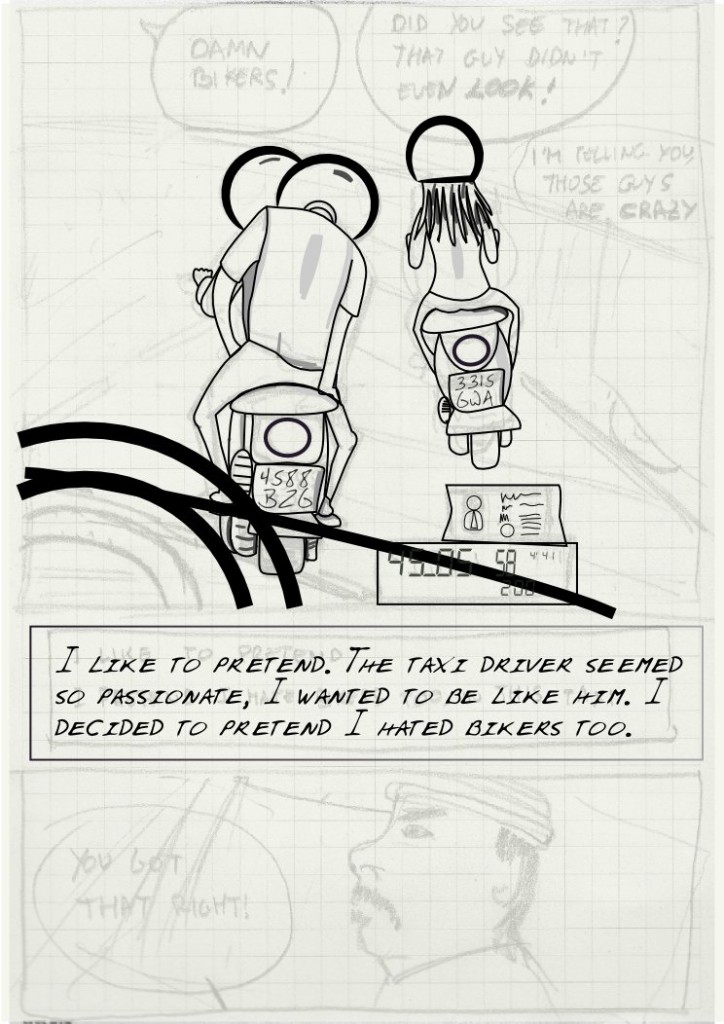
Well this page was intended to have just two panels, with a bit of dialogue. So, it seems I managed to finish panel one. I’m hesitating a lot about the amount of detail I want to put into it. For once, hands of the bikers fly but I wonder if it’s actually worth doing the rest of the bike. The idea is that the reader should just read the balloons and essentially go quickly through the whole page. It looks maybe too schematic but I kind of like it… You can tell that this is my first panel with Inkscape. Will think and gather some input.
(more...)Getting there, slowly 2010-03-08
Well it takes a while to draw, but I think I’m starting to learn. I kind of finished the two bikes, handlebar pending, and I’m now playing with drawing what should pass for a wheel and something that should resemble a windshield effect. Let’s see how that will go.
I’m posting my progress just for the fun of checking how it evolved later.
What's a good style...? 2010-03-06
Well I seem to have a clear idea of what I want to draw, and most importantly of what I want the story to tell and how it should look like. Problem is getting there is not as easy as one would want!
One thing I don’t really like is, well, color. That’s a pretty bold statement, I know.
The thing is I like some color, but just very basic lines, traces of it. That may or may not be linked to the fact that applying color is a real pain too, and that I lack any kind of talent to handle color.
(more...)