Blog: Ripping off friends 11 Jun 2010
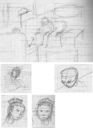
Creating a composition for a panel is a very nice exercise and lots of fun. I usually do some doodling then try it a few more times, then do something a bit more serious, then when it looks about ok I start all the rest.
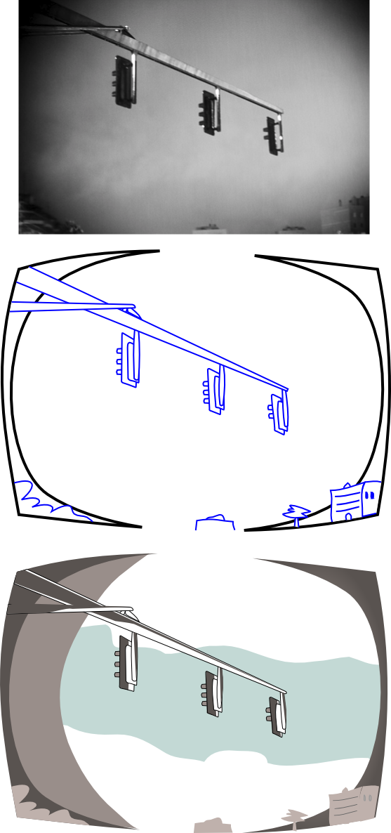
There is another approach, which is basically ripping off from a friend that has a great sense of composition but works in another area, like, let's say, photography :). Today I decided to steal another photo from a friend, in this case the photo is not that great from a technical point of view, after all it was one of the very first ones he took as a learning exercise, but the composition was there and fits very nicely with the one I had in mind. What I did is very simple and not that difficult: 1) find a nice photo, 2) either sketch it maintaining the composition or as I did with this one, actually copy the main proportions, 3) forget about the photo, concentrate on the drawing itself.
I think it works. I like the lack of perfection on proportions and the slightly skewed perspective, although I might fix some of that too. This new thing I'm doing with colors and shadows is also quite entertaining. The drawing should still get some more shades somewhere but I'll do those later.
Here is the process, in all it's glory:
The original photo is from Haripako (shusssh don't tell him). This is the second time I rip one of his photos, more to go ;).
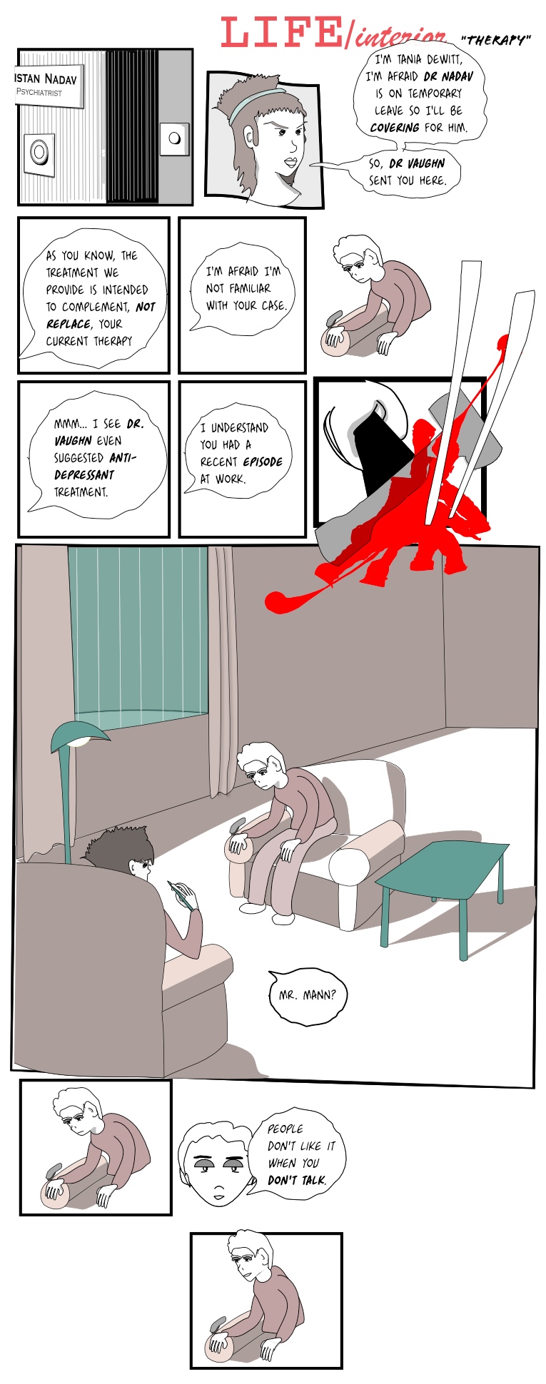
(more...)LIFE/interior: Therapy (4) 06 Jun 2010
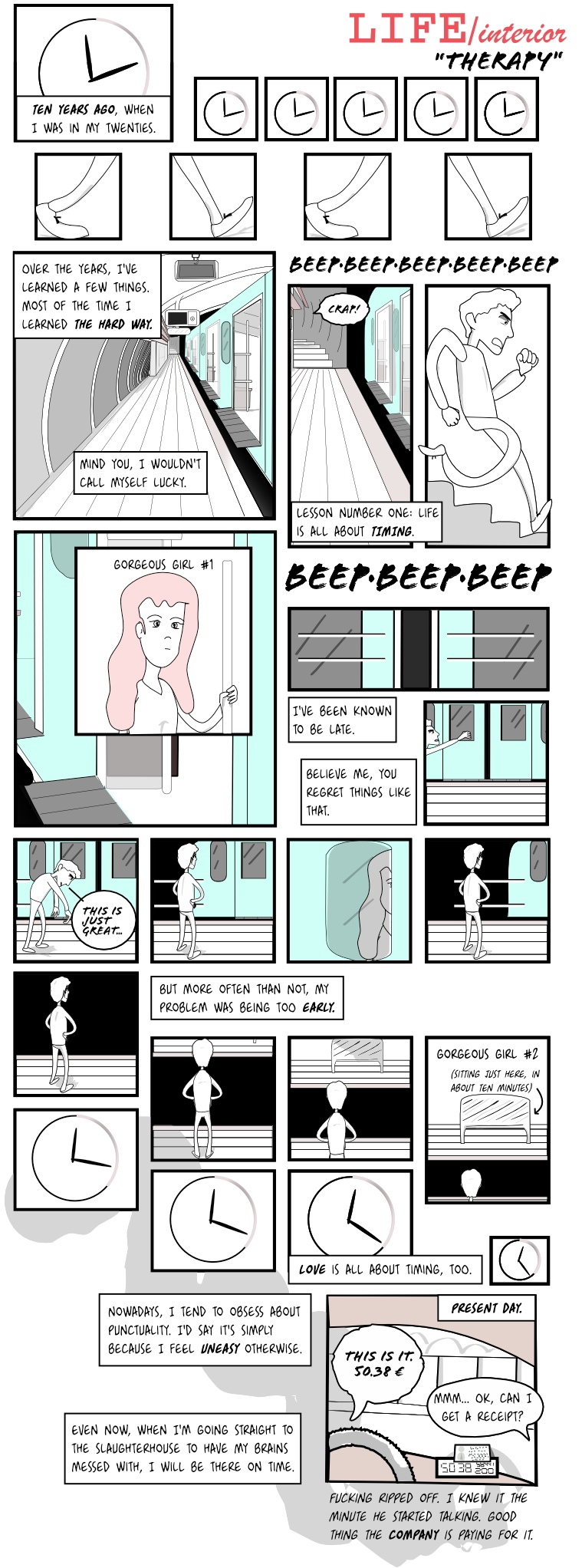
There we go, another piece of the puzzle :). I played for a while with different color approaches. I don't want to go 'full color' because a) it's a lot of work and b) I don't know how to do it properly!
So here is my artistic approach to a bit more coloring and a new way to draw main shadows.
Right now I think it looks ok, although I finished it a bit hastily as usual. I'm pretty sure in a few minutes I'll think a 3-year old would do it better. Let's press Publish quickly.
UPDATE: abide to the grammar nazis out there :)
Edit: Reformatted, changed font.
(more...)Blog: a bit of color 01 Jun 2010
Today I decided to try and put a little more effort into coloring and shadows. Up to this point shadows are most of the time drawn on a separate layer on top of everything, with a filter of type 'darken'. That works great for some shadows, but it doesn't play well with other objects, as it needs to be on top of everything. It's essentially like drawing with a brush over the finished drawings.
I decided to combine that with a different approach: create shadows as just basic shapes with color and put them in the same layer as the rest of the picture, as regular 'citizens' in the drawing. That means I can draw the shadow of a table and then put a table on top of it, without having to spend too much time trying not to accidentally draw over the table while shading.
Mmmm. Maybe that doesn't really make sense, particularly if you've never tried to draw with a vector program like Inkscape.
Anyhow, you can find the result below. First is the draft by hand, then I outline it, then adjust it and make it more round, and finally I play with color and layers:
I created the color palette displayed below the pictures using http://kuler.adobe.com --I don't know much about color, but those just seem right. I've been using the same palette since the beginning, although I sometimes play with transparency and grays.
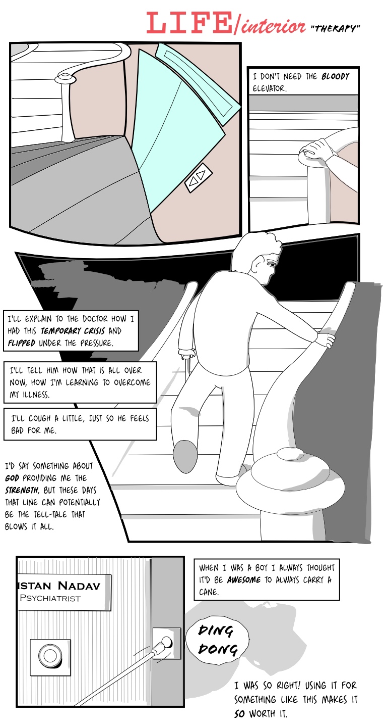
(more...)LIFE/interior: Therapy (3) 27 May 2010
As promised this comes earlier than usual. Let's see if I can get the next one in a week or so.
UPDATE: some spelling corrections :). And since I'm mostly using American spelling, what previously was a lift now mutates to an elevator.
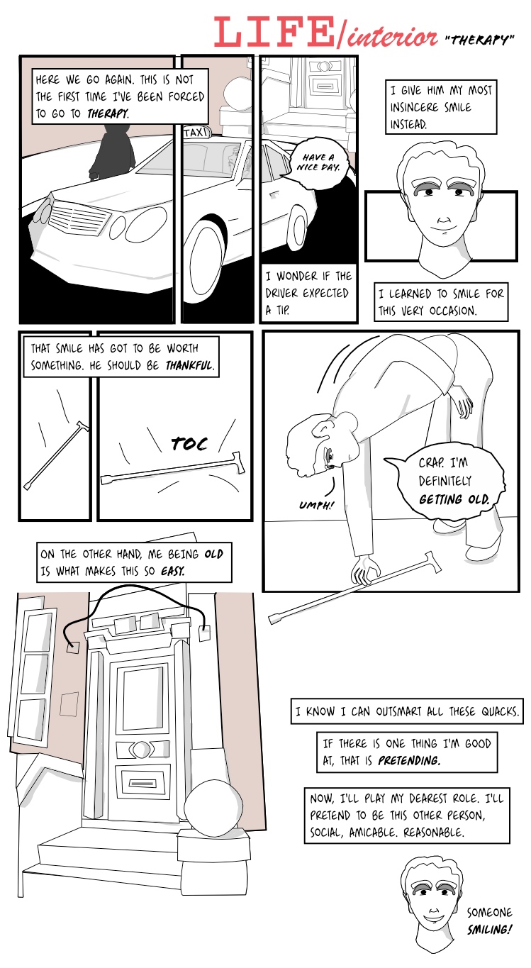
(more...)LIFE/interior: Therapy (2) 26 May 2010
Well this took a while, what can I say. The next one is already finished, will publish tomorrow. I worked the two together, was about to post them as one but I think it's worth splitting them.
Edit: Reformatted, changed font.
(more...)Blog: Sketch away 24 May 2010
Hiya. Well time continues to fly but my little webcomic hasn't received an update for about two weeks. Thing is, I'm still working on it, it just takes time and it's hard to concentrate when there is this bright sun everywhere trying to drag you out to the streets.
I'll try to keep this a bit more interesting by posting again some drafts and then compare those to whatever they come out to be. Usually I redraw things so much they barely resemble the original sketch, so this makes for an interesting test.
As you can see my drawing of females isn't improving that much, but I keep trying.
(more...)LIFE/interior: Today 15 May 2010
So there's going to be a few flashbacks, hopefully obvious after a while. This is present day.
Edit: changed font and the text's layout.
Edit: reordered this page.
Edit: Reformatted, changed font.
(more...)Blog: Aging 15 May 2010
I'm starting to think my story is a bit too ambitious given my current abilities :), but foolishness can get you quite far. Thing is, the story I'm trying to tell is supposed to go back and forth between three different ages of the main character. That means I need to be able to draw the character in three different stages of his life (as if it was not difficult enough to draw one character in more than one position!).
So currently I've drawn mostly the childhood years and some snapshots from the young years (although I should revisit them and slightly change the look of the character a bit). Now I need to draw the character quite a few years later. It turns out it's quite difficult to actually age characters (but fun too!). I'm starting to understand why most comic characters don't age at all. Take a look at this amazing guide at Cedarseed's site or if you prefer, at Deviantart. Of course, as my style of drawing is quite different, not all of that applies to my particular case but it serves as a very nice starting point.
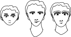
This is what a first approach to The Three Ages looks like in my world (not exactly like these other Three Ages):
It was a very interesting effort. I chose the gray eye lids and the white hair as a guidelines for the three figures. The old age I'm trying to draw is not supposed to be really very old but it's more a case of premature old age (more on that as the comic advances).
Another fundamental point about 'old age' is that whenever I try to draw the character as a premature-old person I start drawing him with very unlikely clothes. I mean, old people in my mind always wear a slightly ragged, dark colored suit, maybe some kind of hat and of course a walking stick. Question is, how will old people look like 20 years from now? Will we see them in their 'vintage' G-STAR RAW jackets and think they need to renew the wardrobe? Oh the difficulties of life.
(more...)LIFE/interior: Therapy (1) 08 May 2010
Well I think I'm starting to have a regular schedule. This one came out a bit too large I think --it's roughly twice the usual size-- but splitting it into two made the resulting two pages too small, so anyway this is a webcomic so playing with the canvas size is ok, isn't it?
This page brings backs the main storyline and is linked to one from a few weeks earlier, remember that one with the taxi driver and the bikes? Yep, that one.
See? There is an actual plot here, it's not only me playing with Inkscape.
Update: Rearranged text, added references to time.
Edit: Reformatted, changed font.
(more...)LIFE/interior: Childhood (4) 03 May 2010
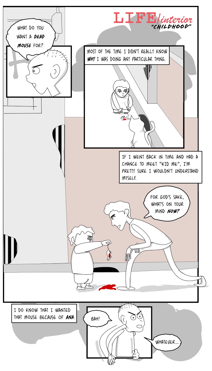
Well this marks the end of this mini flashback. Next two pages will bring back a different part of the story and I hope that once you put it all together it starts to make sense.
I'm publishing again without much time for polishing but I think it works the way it looks, and I need to keep moving the story forward. :)
Update: rearranged and changed text.
(more...)