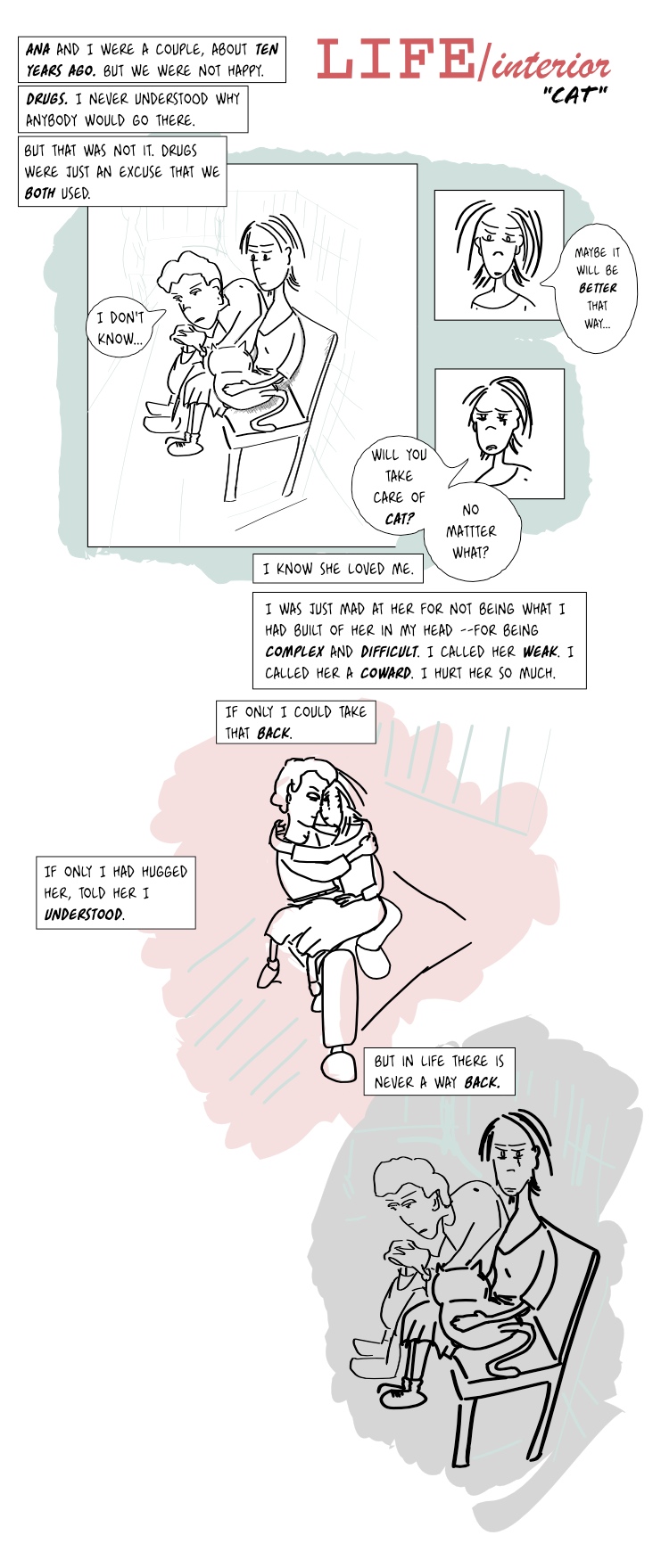
LIFE/interior: Cat (2) 04 Oct 2010
I doubt whether to apply shades/color or not, to this one.
Sometimes, particularly when the drawings are intentionally rough, intended to read fast or when the focus should be in the narrative, I feel they look better with very little shading. In fact, as little as almost nothing.
I tried shading this a couple of times, and it didn't seem to feel as I'd like it to. So I'm leaving it as is, and see what people think of it. Also, yesterday's page didn't bring anything new narrative-wise, other than Mr Mann living with the cat, so this one might compensate for that.
Or not :).
Update: Changed font and line weight.
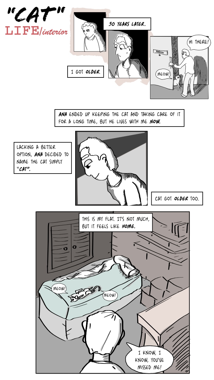
(more...)LIFE/interior: Cat (1) 04 Oct 2010
Well this is a short one but it's getting late. I'm experimenting a bit more. I'm trying to make the childhood days more cartoonish and the older days slightly more 'serious', or at least have different looks. This time I combined hand-drawn drafts with a bit of direct inking with the calligraphy tool and playing with fills.
This starts a new episode, this is present day. I keep changing the face of Mr Mann so I tried to make it more obvious but... you tell me if I succeeded.
Note: the clever ones will notice that cats don't live 30 years. It should actually be the same cat so I have a problem here... maybe I should just make it 20 years later... or maybe I'll make it the son! or the grandson! We'll see.
Update: Changed font.
(more...)Blog: Pencils vs Pens vs Digital 23 Sep 2010
Let's sample some of the results of my experimentation...
Here are some scans:
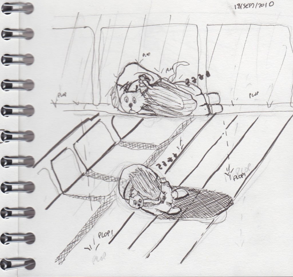
This is hand-drawn, first drafted with a regular pencil, then more-or-less-inked using pens. As you can see I don't really know what to do with the brush-like pen I bought so I tried using it to make some lines stronger but it didn't work too well.
I didn't erase the pencil, so you can actually see what I changed.
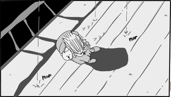
Then, I scanned this and put it on a layer in Inkscape (actually although the above is a scan, I used a photo because I didn't have the scanner at hand). After that I used mostly the pen tool to draw the lines, and the calligraphy tool for most of the shading, all inside Inkscape.
In fact, the above is one of my favorite panels so far.
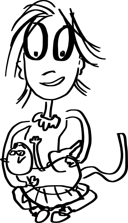
Then, the following was drawn directly using Calligraphy tool, as a sketch:
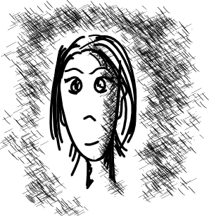
Finally, I took that same drawing directly and just added some shading and a bit of color here and there, and fixed some things (mostly when lines crossed each other).
I particularly prefer the second option, but just because the rest of the comic looks like that. I think I could do some story using just those pseudo-drafts, with minor tweaking for shading. This last one is also nice and has the advantage of being the fastest of all, as you work digitally during all the process.
(more...)Blog: Crosshatching in Inkscape 0.48 22 Sep 2010
I upgraded to Inkscape 0.48 and so far it's not going too well, it crashes a lot but this time it usually saves your work correctly before dying. There are a few good things, though. One of them is the Spray Tool.
As I'm trying different drawing styles, one thing that is very nice and quite easy to do by hand (albeit a bit tedious) is 'crosshatching' to display shades. That is, using lots and lots of lines to represent shades, forming a pattern. My first surprise was that there is no standard crosshatch pattern for filling, which seems odd (it has stripes, sand and other strange ones). There must be a reason but in any case that type of crosshatching is always perfect and that is not what I wanted.
First I created a few lines, with the calligraphy tool set to Dip pen, width 1, Stroke size 0.1, in a 300% zoom. These numbers will vary wildly depending of what you do. I created a pattern like this:
Then I selected it, pressed the Spray Tool (new to Inkscape 0.48) and just sprayed with it to do the shading:
You can also enable pressure use for the spray tool, play with the width and in seconds do shading. I didn't put any effort on the actual drawing here, it's just an example :).
If you put a little more effort on the actual pattern to be used by the Spray Tool and apply it more carefully than I did I'm pretty sure the results will be quite good. I'll be trying it out soon!
(more...)LIFE/interior: Ana (6) 19 Sep 2010
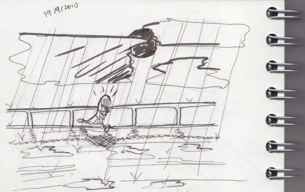
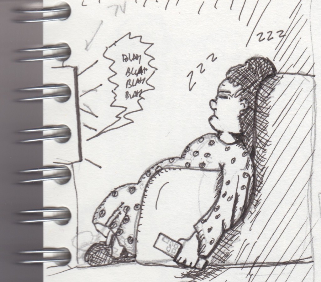
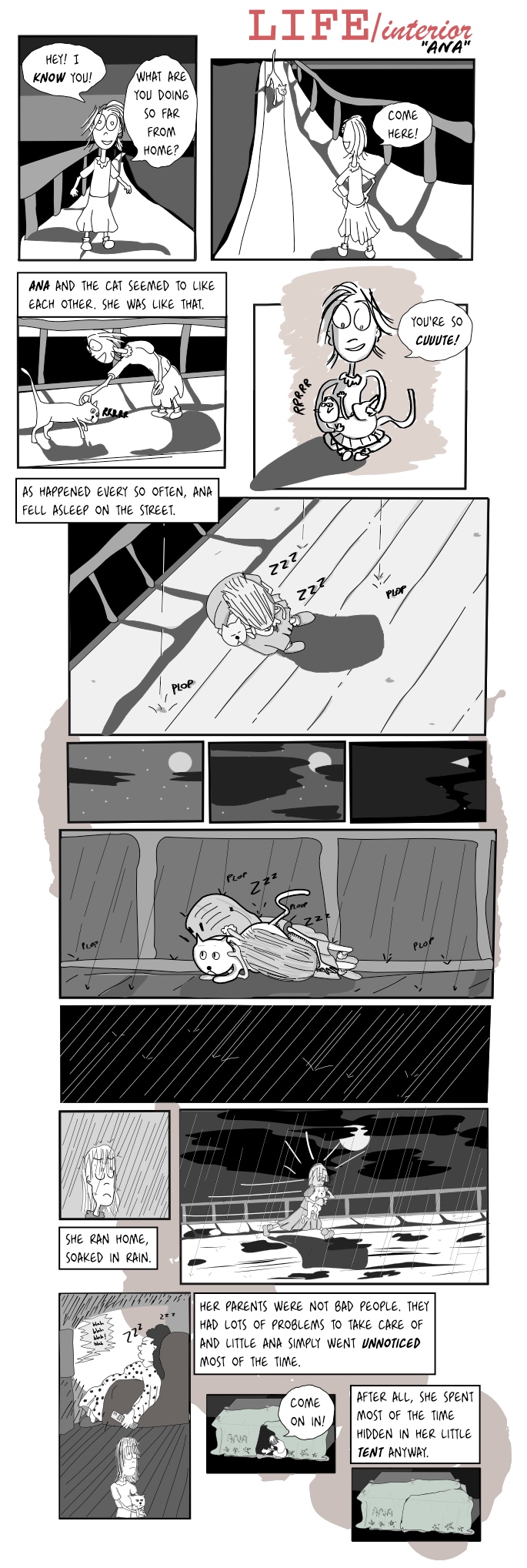
Well, another page. This one took quite a lot of time but at least this time I've done some of the 3-panel comics to keep things moving and me practicing. I've been trying out different drawing methods, as usual I'm still learning a lot. This time I tried two things: actual drawing with a proper sketch pad and pens, and drawing directly on the screen. The sketched panels work quite well but I felt they would break too much the style of the comic so for now I only use them as a draft and 're-ink' them on screen. I'll post a blog entry with the actual sketches. Oh, and I need to find a way to crosshatch in Inkscape.
Let me know if what happens in this comic is more or less understandable. I'm still struggling sometimes finding ways to transmit what is so clearly inside my head.
Update: Changed font.
(more...)Blog: Calligraphy vs pencil tools in Inkscape 12 Sep 2010
I see lots of people praising the calligraphy tool in Inkscape, like these guys. That tool is essentially the one that lets you draw as if you were holding some kind of pen or a brush. It's pressure-sensitive so it generates more or less realistic and 'alive' strokes.
On the other hand, the pencil tool generates just plain bezier lines that you can bend and modify afterwards. It follows your trace and kind of approximates what you are trying to do. After drawing a stroke, you can modify it quite easily, whilst the calligraphy tool generates strokes that contain so many nodes that it's not worth trying to rearrange it, it's just better to redraw that particular stroke.
Right now most things you see in my comics are drawn using the pencil tool. That's why they have a clear-line look. I like how it looks, although it's quite a lot of work. I sometimes scan hand-drawn drafts but now I've started doing those drafts on screen using the calligraphy tool and then creating the final version with the pencil tool. I should be brave and start using the calligraphy tool for the final result, but I somehow feel more comfortable with the pencil approach, right now. Incidentally, the calligraphy tool is very sensitive to zoom so if I zoom in the strokes become thinner. It's a bit weird there might be some way to avoid it but right now I can't seem to find it.
Here's a sample draft with the calligraphy tool. It just takes a minute to draw something like this:
I like the simple appearance. On the other hand, here's an image first drafted with calligraphy and then redrawn using the pencil tool:
The second drawing took a little longer to draw, but it's still only a few minutes. The difference lies in doing further modifications: I can now tweak, shade and otherwise work with this image in a way that is simply not possible with the calligraphy approach.
I think I'll continue using the pencil for a while but I'm going to experiment on separate comics with the calligraphy tool.
(more...)Dangling comments 11 Sep 2010
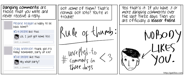
I'm sorry to break this to you but, sir, being accepted as a friend on Facebook doesn't mean people actually like you.
(more...)Tiny little tragedies 04 Sep 2010
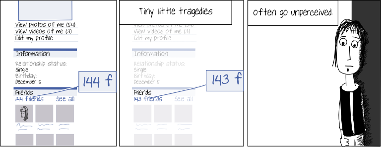
Just wanted to picture those little stories that nobody hears about but can be spotted if you look hard enough, particularly in this technology world we live in. I thought about using 'All memories are traces of tears' but that's too good a quote to waste here :).
I'll try a few representations of the same theme.
(more...)LIFE/interior: Ana (5) 22 Aug 2010
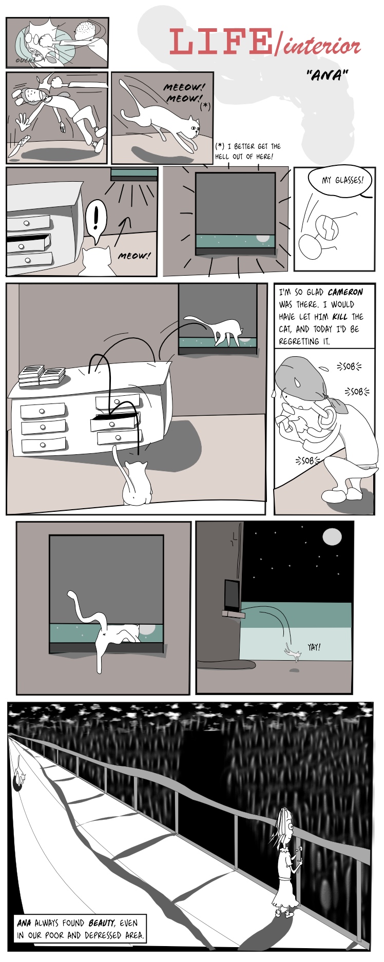
Closing the cat incident :).
I drew a few versions of the last panel, and none of them convinced me that much. I think this one kind of works but it feels a bit at odds with the rest of the page. Anyway, there it is!
Credit: The 'prisoner cat' resolution via escaping through the window idea and drafts were made by a Ninja that pops around here sometimes. Truth be told, that version included also scenes of happiness with a mouse that was not actually dead and instead a very good friend of the cat but I omitted those because I prefer evil.
Update: Changed font.
(more...)