blog
I got a bit distracted 30 May 2011
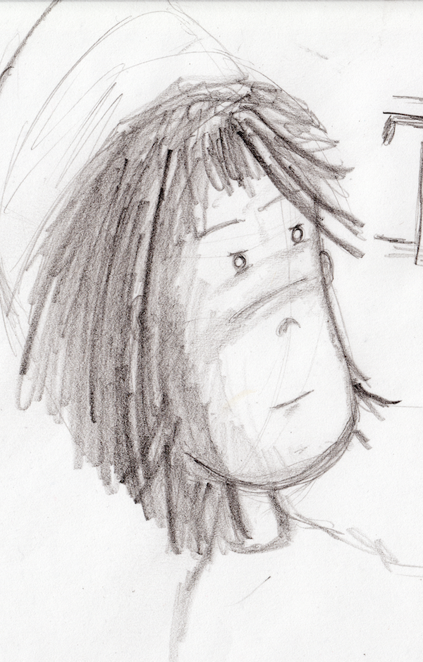
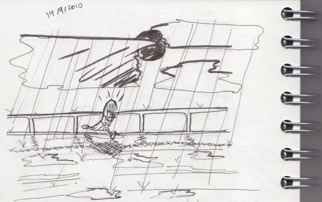
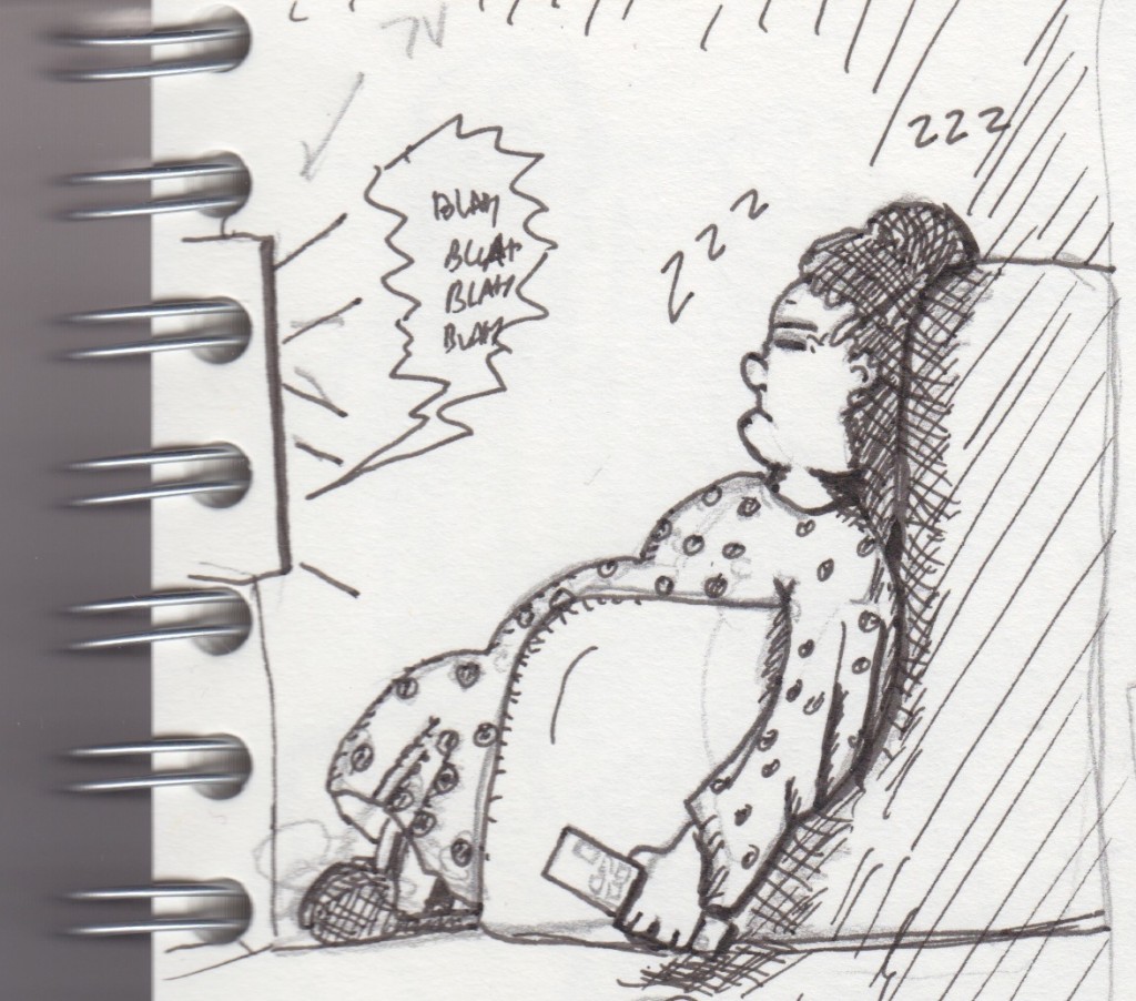
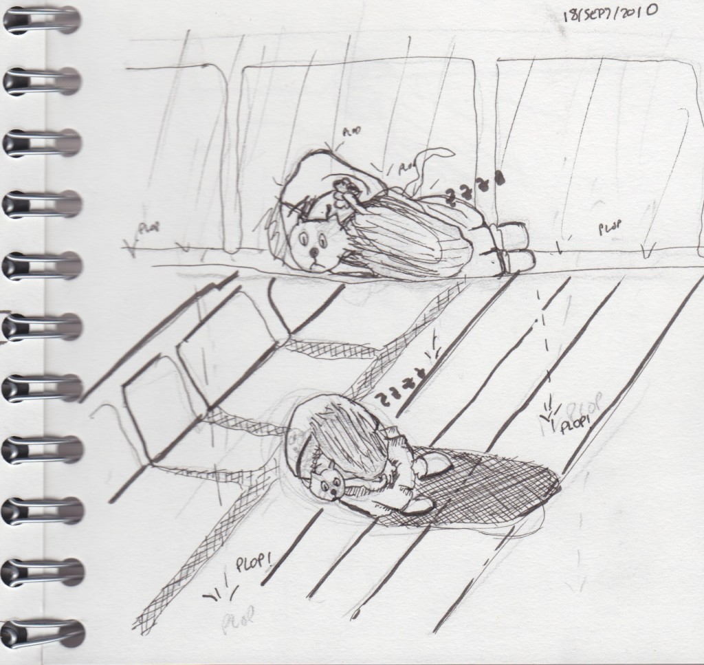
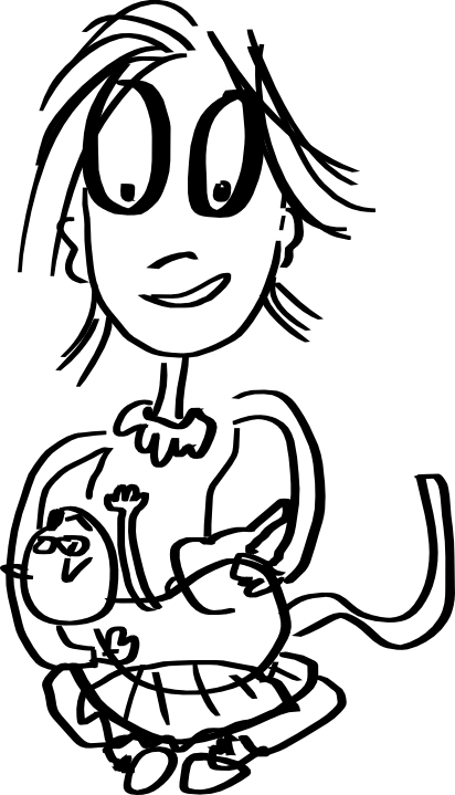
I have an outline for the next page but somehow got distracted drawing with this graphite pencil. It's a lot of fun. Pencil doesn't really translate very well to the screen, so I did the trick with the auto levels of Mac OS X's preview and it looks better.
The pen is a Cretacolor Monolith, which is particularly interesting because it's essentially all graphite, no wood, but still feels like a normal pencil.
I've been doing some other sketches but maybe it's a bit too early to upload them, I'm thinking of a new character for the 3-panel strips (or similar) format.
(more...)Blog: Encounters of the third panel 23 Jan 2011
I like to now and then, draw one of those three panel comics. It's really interesting how much you can say with only a few words. It's also fascinating how difficult it is to make it right.
Most of the time, the humor is so narrow that only a few people actually understand what's going on --and that doesn't mean they will all find it funny, which narrows the audience even a bit more.
Most of the 3-panel comics I follow have very well established characters, usually just two or three. What I wanted to write about is something that puzzles me: invariably, in the comics I like, you can identify the main characters easily and get to know their persona without needing to have them introduced first. It's as if they had always been there, always. Take Robby + Bobby as an example, he's managed to create two great characters. You can just read a strip and immediately understand it, even if there is absolutely no context.
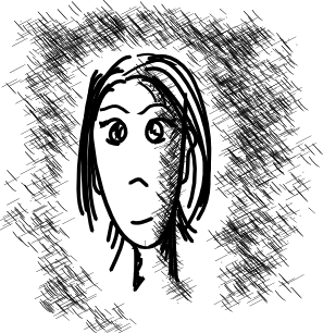
My latest attempt, Paul the innovator, is probably only going to be funny for me and a few coworkers, as usual.
 Paul is a so-called innovator in a corporate world.
Still, I'd like it to be easily identifiable and funny for other people too, but the only way I can think of doing that is by writing a few strips to fully define the character. Which means, I'm not doing it right :).
Blog: Merry Xmas! 23 Dec 2010
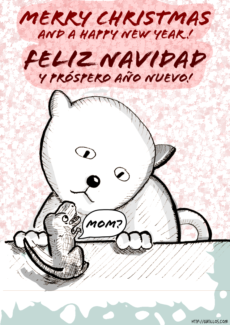
Everybody approaches these holidays in a different way. I decided that, in order to avoid offending those with different religious sensitivities, I should choose a topic that everybody liked, no matter your origin and beliefs.
Hope you appreciate it. Next year will see the Spanish translation of my main webcomic, too, hence the bilingual message :).
(more...)Blog: Updating the archive 15 Nov 2010
I've been reorganizing the 'LIFE/interior' comic. I'm trying to bring more consistency to the story, essentially updating dialogues and adding a bit more context here and there. Most noticeable, I changed the font used for balloons. The font is now Blambot's Artists Alley, essentially because I can't --for the life of me-- find a license for Yankshand, the font I was using before. Apparently the company that owns the rights went bankrupt so the font lies there in limbo, although many sites wrongly offer it and label it as free. I'm using all capital letters for text now, and rearranging/updating some texts.
Some of the pages were too big and that poses quite a few logistics problems, so I'm reducing all pages, trying to make them smaller than 2048 pixels height and 768 width, but without removing content or reducing text size. For some of the pages, the only option is to split them into two or three. When I do that, the RSS feed gets updated and some feed readers like Google Reader get a bit confused and show new pages although they have an old date and should not be displayed. Just check them out if you want, but you can ignore them.
At some point the archive will be completely updated and I'll post about it.
(more...)Blog: Extracting ink from scans 31 Oct 2010
I thought I would nicely document what I'm doing right now in terms of transforming a regular scan of an inked comic into a transparent image that can be added to Inkscape (or Gimp) for coloring and shading.
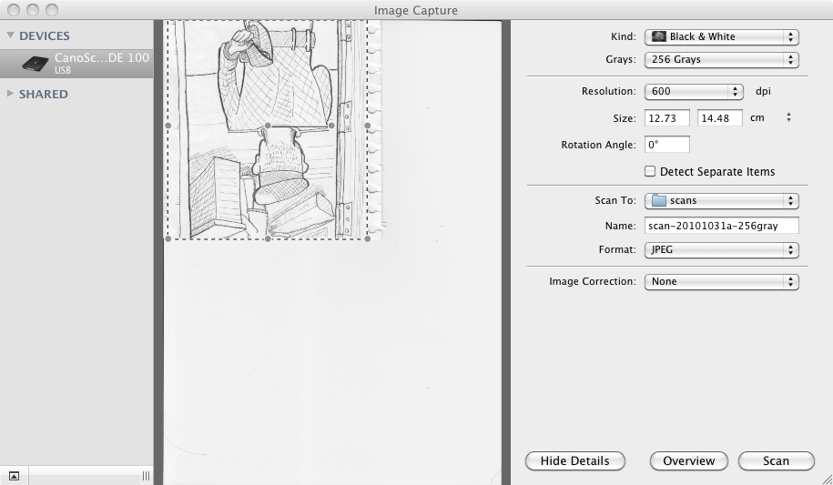
Step one, scan an image: I'm doing it using Image Capture in Mac OS X just because it's dead simple. I stay far far away from software provided by Canon, it's simply not worth it for my needs. Here's a capture of the process:
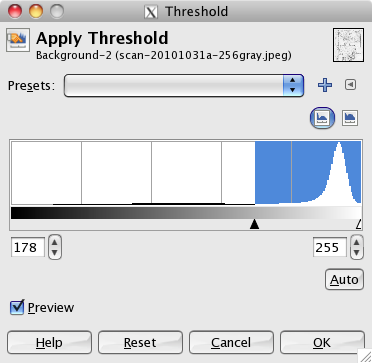
Step two, open image in GIMP and Color-Threshold it: It's a bit of an unfortunate name for such great software, "Gimp", ahem, but let's put that aside for a minute. In my case I did first an Image --> Transform --> Rotate until I had it looking the right orientation. Then from the Colors menu I selected Threshold.
From the manual:
The Threshold tool transforms the current layer or the selection into a black and white image, where white pixels represent the pixels of the image whose Value is in the threshold range, and black pixels represent pixels with Value out of the threshold range.So, the background is mostly slight variations around a shade of white, and ink is slight variations around shades of black. What we want is to end up with an almost pure white background.
Option 1: Use the 'Auto' setting. This seems to work most of the time. In my case it gives 178 - 255 as values. Option 2: Adjust manually, this can also be used to make it more restrictive and then apply filters to the resulting image to enhance the result.
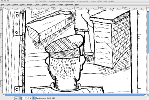
The max threshold will most likely always be 255 (all white). I went for the Auto this time. Here is the resulting image, if you look at it in zoom you'll see some detail was lost, but not too much.
Step Three make background transparent: This is very straightforward when you know where everything is, but a bit daunting at the beginning.
- Add a transparency layer, by selecting Layer --> Transparency --> Add Alpha Channel.
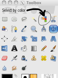
- Now choose the Select by Color tool from the palette
Once selected, just click somewhere in the background and it will select all the colors around the click pixel, within a range to accommodate slight differences (e.g. all shades of white). Since this is already a pure white background it's not going to do much, but you would need it for regular images as in those the background will never be completely made of pure white. The range is defined by a Threshold in the Toolbox.
After clicking, the whole background is selected. The selection is indicated by a set of moving lines lines that look like this (you won't see much in the thumbnail, click to see the selection):
Now you just press the Delete key or select Edit/Clear and the white background will be removed.
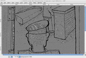
The above is the image as displayed in Gimp with a transparent background (Gimp uses a checkered gray background to indicate transparency). Now the final image looks like this:
Finally all you have to do now is take this image and insert it into a separate layer either in Photoshop/GIMP or Illustrator/Inkscape and add the rest of the elements and shading.
So, why all this trouble? what was the point? Well, color is much easily applied in a layer below the ink layer. If you try to apply color over an unmodified scan, well, it's not going to be easy. In order to do that, you need a transparent ink layer.
But we will leave that for a future post.
Update: You can see the final image in the this comic post.
(more...)Blog: Slightly different style for a panel 14 Oct 2010
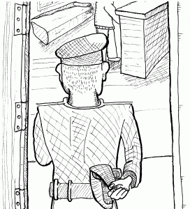
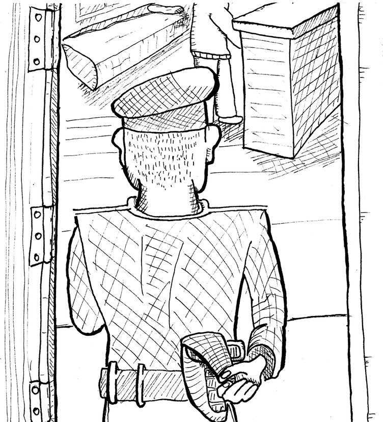
Yesterday I was playing with the scan of a drawing I had previously inked by hand. I added some shadows using Inkscape and have yet to decide whether to use it or to redraw it using vector graphics. Maybe I'll just fix a bit the shapes inside the room and call it a panel :). I love drawings with this rough feeling, I only worry that maybe it's hard to recognize the actual contents of the panel.
What do you think? Can you tell what is going on without too much effort?
Blog: Pencils vs Pens vs Digital 23 Sep 2010
Let's sample some of the results of my experimentation...
Here are some scans:
This is hand-drawn, first drafted with a regular pencil, then more-or-less-inked using pens. As you can see I don't really know what to do with the brush-like pen I bought so I tried using it to make some lines stronger but it didn't work too well.
I didn't erase the pencil, so you can actually see what I changed.
Then, I scanned this and put it on a layer in Inkscape (actually although the above is a scan, I used a photo because I didn't have the scanner at hand). After that I used mostly the pen tool to draw the lines, and the calligraphy tool for most of the shading, all inside Inkscape.
In fact, the above is one of my favorite panels so far.
Then, the following was drawn directly using Calligraphy tool, as a sketch:
Finally, I took that same drawing directly and just added some shading and a bit of color here and there, and fixed some things (mostly when lines crossed each other).
I particularly prefer the second option, but just because the rest of the comic looks like that. I think I could do some story using just those pseudo-drafts, with minor tweaking for shading. This last one is also nice and has the advantage of being the fastest of all, as you work digitally during all the process.
(more...)Blog: Crosshatching in Inkscape 0.48 22 Sep 2010
I upgraded to Inkscape 0.48 and so far it's not going too well, it crashes a lot but this time it usually saves your work correctly before dying. There are a few good things, though. One of them is the Spray Tool.
As I'm trying different drawing styles, one thing that is very nice and quite easy to do by hand (albeit a bit tedious) is 'crosshatching' to display shades. That is, using lots and lots of lines to represent shades, forming a pattern. My first surprise was that there is no standard crosshatch pattern for filling, which seems odd (it has stripes, sand and other strange ones). There must be a reason but in any case that type of crosshatching is always perfect and that is not what I wanted.
First I created a few lines, with the calligraphy tool set to Dip pen, width 1, Stroke size 0.1, in a 300% zoom. These numbers will vary wildly depending of what you do. I created a pattern like this:
Then I selected it, pressed the Spray Tool (new to Inkscape 0.48) and just sprayed with it to do the shading:
You can also enable pressure use for the spray tool, play with the width and in seconds do shading. I didn't put any effort on the actual drawing here, it's just an example :).
If you put a little more effort on the actual pattern to be used by the Spray Tool and apply it more carefully than I did I'm pretty sure the results will be quite good. I'll be trying it out soon!
(more...)Blog: Calligraphy vs pencil tools in Inkscape 12 Sep 2010
I see lots of people praising the calligraphy tool in Inkscape, like these guys. That tool is essentially the one that lets you draw as if you were holding some kind of pen or a brush. It's pressure-sensitive so it generates more or less realistic and 'alive' strokes.
On the other hand, the pencil tool generates just plain bezier lines that you can bend and modify afterwards. It follows your trace and kind of approximates what you are trying to do. After drawing a stroke, you can modify it quite easily, whilst the calligraphy tool generates strokes that contain so many nodes that it's not worth trying to rearrange it, it's just better to redraw that particular stroke.
Right now most things you see in my comics are drawn using the pencil tool. That's why they have a clear-line look. I like how it looks, although it's quite a lot of work. I sometimes scan hand-drawn drafts but now I've started doing those drafts on screen using the calligraphy tool and then creating the final version with the pencil tool. I should be brave and start using the calligraphy tool for the final result, but I somehow feel more comfortable with the pencil approach, right now. Incidentally, the calligraphy tool is very sensitive to zoom so if I zoom in the strokes become thinner. It's a bit weird there might be some way to avoid it but right now I can't seem to find it.
Here's a sample draft with the calligraphy tool. It just takes a minute to draw something like this:
I like the simple appearance. On the other hand, here's an image first drafted with calligraphy and then redrawn using the pencil tool:
The second drawing took a little longer to draw, but it's still only a few minutes. The difference lies in doing further modifications: I can now tweak, shade and otherwise work with this image in a way that is simply not possible with the calligraphy approach.
I think I'll continue using the pencil for a while but I'm going to experiment on separate comics with the calligraphy tool.
(more...)Blog: Time passes 15 Aug 2010
Well it's really taking me a while to draw the next page. All the drafts and dialogue are finished, it's just a matter of... well... drawing :).
Here's a sneak peek of what's to come. Oh the mystery.
