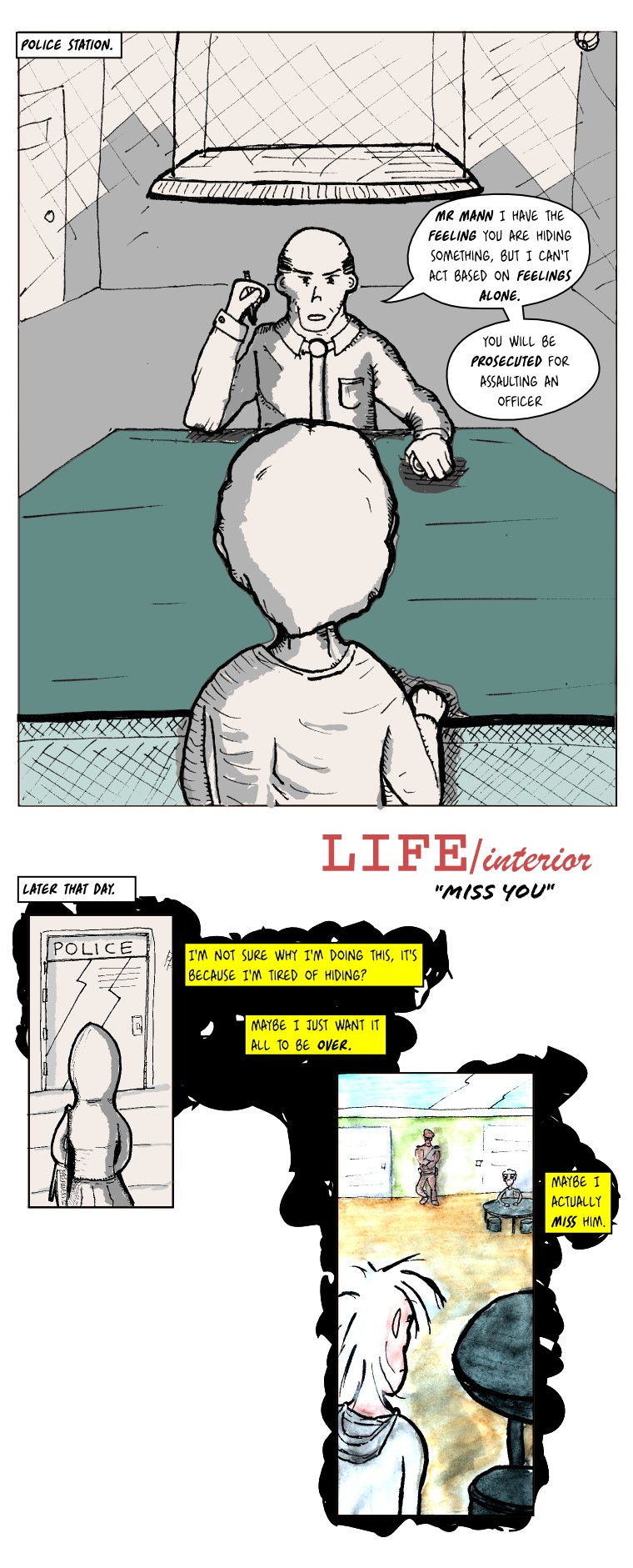
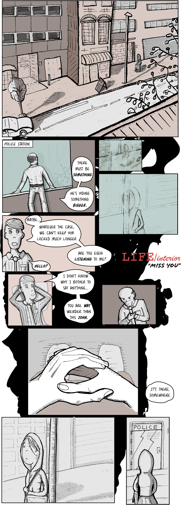
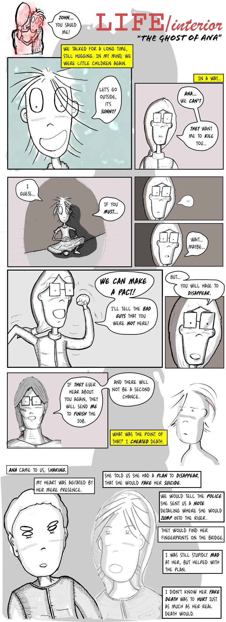
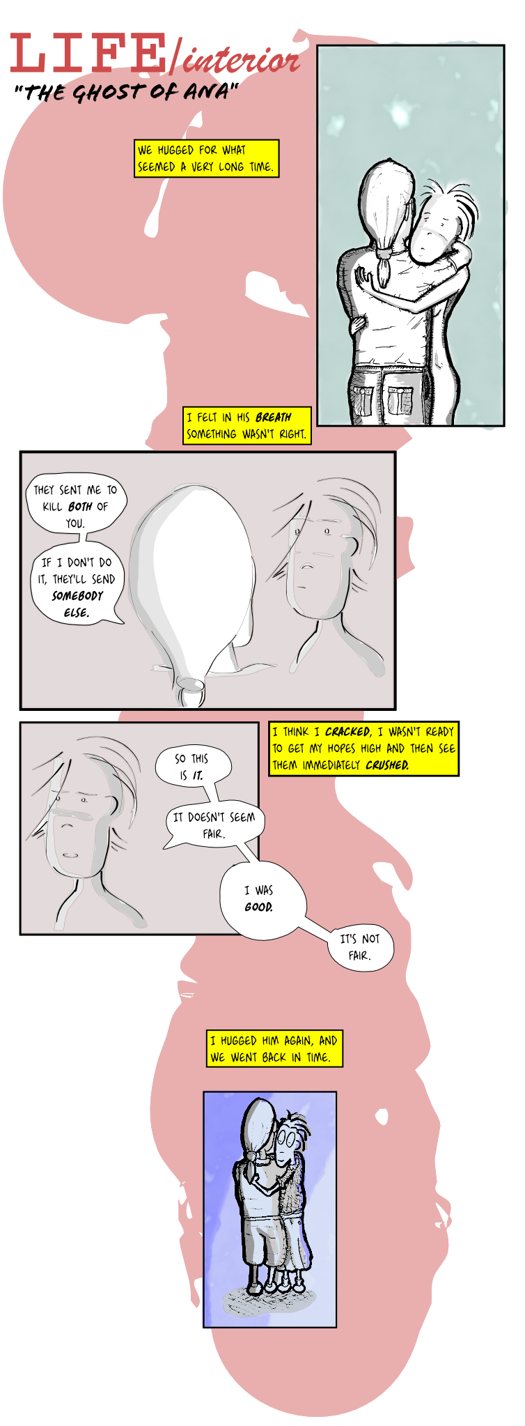
A little more close to a re-encounter. Not that much artwork on this one, but you get the idea :).
Oh, guess who bought a set of watercolors :).
(more...)
I like drawing Ana, maybe I'll make a spinoff :). I like to draw Mr Mann too but I can't seem to draw him in a consistent way. So anyway, I think it's about time we put these two together, isn't it?
Technicalities: not much new here, all drawings are hand made but with different paper. Some of these panels are actually huge A4 size drawings, because I was trying what happens when you do that. Essentially it's ok but if you don't do it consistently (i.e. if you do it like me :)) the line weight looks too different between one panel and the other. The image is a big uncompressed png, maybe it'll take a while to load.
(more...)Well, what can I say, sorry for the delay. The story continues!
(more...)You've got to love team players :).
(more...)The author is a bit under the weather (imagine some kind of stormy weather that lasts for too long) and will need a bit of time to catch up. The LIFE/interior series will be continued shortly, shouldn't be more than a week.
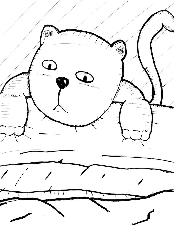
Here's a cat for you.
(more...)I'm tempted to put screenshots here, to prove my point. I'll continue with the passive-aggressiveness, instead.
(more...)Well, a new page, leaving the gore aside for a while. This one is a bit rushed and rough, sorry about that. My excuse this time it's that I have a cold and it's hard to do straight lines while coughing. Also, I damped a draft drawing with spilled coffee :).
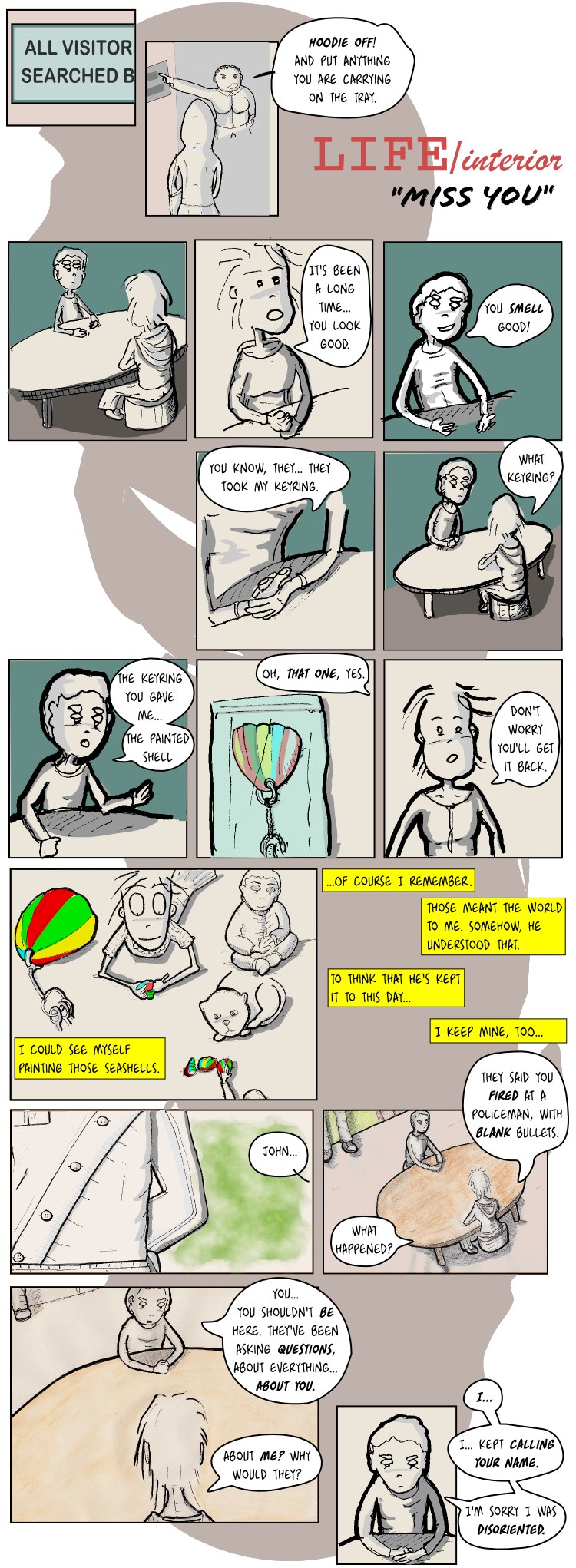
Technicalities: This is an interesting one. I discovered one thing I was doing wrong: Inkscape's calligraphy tool is better used with no stroke set, just the fill color. I don't know why I didn't notice this before! Otherwise the lines are too thick and lack the natural brush-like endings. The first and last drawings are obviously hand drawn, the middle ones are all drawn directly on the screen. I used the Gouache texture filter on some panels. Oh, it's also a PNG, not sure if that makes any difference.
(more...)New page, I'm getting a bit tired of the violence, so don't worry it will be over soon. I really don't like this page that much, it's too messy, but I'm tired so this will have to do :). Let's go back to the happy times.
Technicalities: Not much, all scanned images, some with the no-bleed paper, some with the regular one.
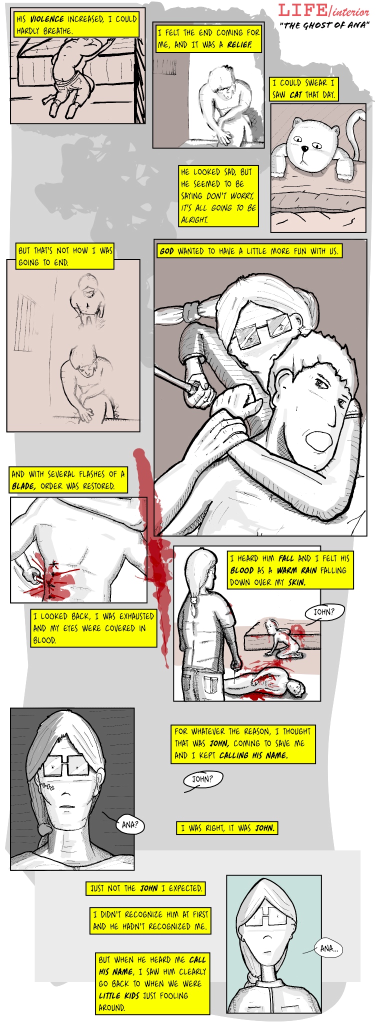
(more...)Well, a tiny flashback to explain who that guy was. I'm almost finished with the gore, I swear kind of assure. I'm liking these drawings a bit more, it's all about paying attention to volume, as people keep saying and repeating. If only I would listen from time to time!
It's not that I do the whole sketch-with-models then draw thing, but I do try to outline the figure using stick figures, well actually stick 3D geometrical figures. Of course, whenever I'm in a hurry I bypass all of that and just convince myself it doesn't look that bad. Still, drawing the same face and body in many different angles is a nightmare if it was not defined clearly. The only ones I can say were defined clearly are Ana's and kid Mr Mann's. You can tell those two are usually easier to identify than the others, no matter the angle you see them.
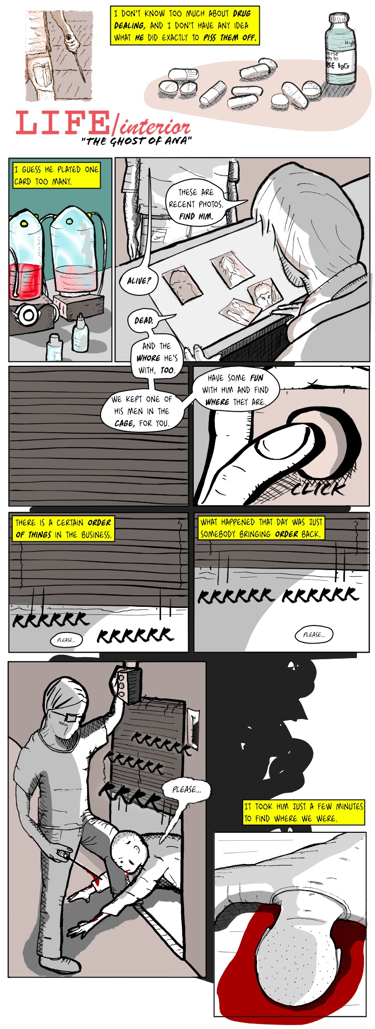
The gangster-like expressions in this page were reviewed and approved by linguists. Blame them.
Technicalities: The close up of the hand pressing the button and the metal shutters opening are all done freehand on the tablet, using Inkscape's calligraphy tool. The rest were hand drawn on the "bleed proof" paper I got the other day. I'm drawing the graphics a big bigger than usual, and shrinking them after scanning.
(more...)I'm trying not to make it too gore, but the only way to tell this part of the story seems to do it like this, otherwise it lacks the necessary strength. For the record, I thought about Ana being named Alaska instead, but I don't know how many would have picked the reference (hint: this). Maybe that's already an obscure reference. It's so cold in Alaska.
Anyway, can you see the script is heading somewhere? I know you all doubted it :).
Technicalities: drawn using a different paper, one that says in big letters "bleed proof". Somehow I'm actually missing the ink bleeding of the sketch book. We'll see if I get back to that.
(more...)