blog
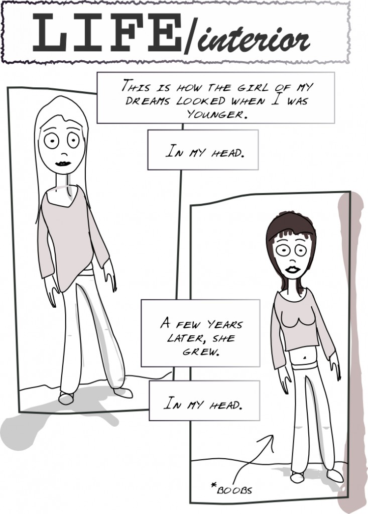
First page for LIFE/interior 18 Mar 2010
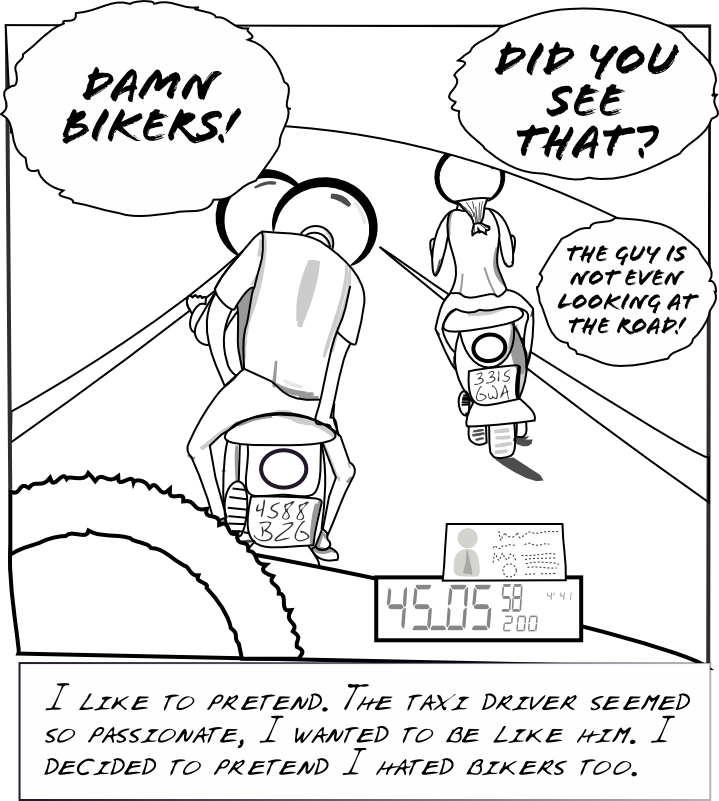
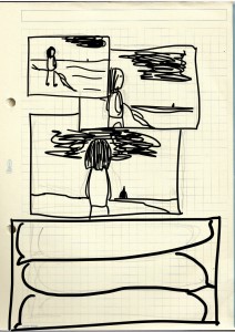
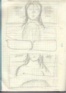
This is a slightly more polished version of the previous draft. I realigned the balloons to make it easier to follow and added panel lines.
So, is this a webcomic? 14 Mar 2010
Well, I've been analyzing the 'webcomic' concept in itself. As I see it, it puts the following constraints:
- You need to create pages within a reasonable time
- Once a page is up you can update it, but most people will miss those updates
- Most importantly: you can't rearrange the order of pages
- The layout of the site should focus on the webcomic, one page at a time
I like the second point, being somewhat forced to update on a regular basis is definitely something I want --I'm lazy. But the third one is the actual key point, as this is intended to be a live and ongoing process, something that ideally would be followed via regular visits (perhaps through an RSS reader), you don't have the liberty to rethink what you did.
I think I'm ok with this, I think as long as you understand it, the end result can be great. One approach would be to define the story completely before drawing anything else. The other would be letting it evolve and 'define itself'. I think the story will definitely benefit if the major plot points are well define beforehand, but I also like to have the ability to tweak it along the way...
On the subject of the site itself, I'll be updating it shortly to display the comic in a more 'webcomic-like' layout. I think I'll keep the blog as it is and create a new page for the webcomic itself, with a separate RSS feed. I like also the idea of creating an iPhone-specific version as was suggested to me by a friend.
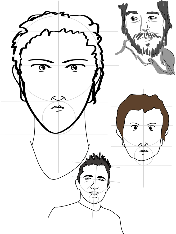
Anyway, I've been drawing some faces to train myself and also looking for the face of the main character. The more realistic ones were drawn based on photographs, and as such are probably not really suitable for main characters.
Let's move on to the story 12 Mar 2010
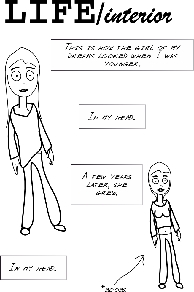
So here's a page two and a title I like. "LIFE/interior". It's a pity the domain is already taken, because I think I'm going to go with it.
Will probably design some title or play with different fonts. I'm feeling again this need to just add some very basic shades to this draft and call it a page. Strange that my artistic feelings tend to align with whatever is easier.
(more...)Well, still with the same page... 11 Mar 2010
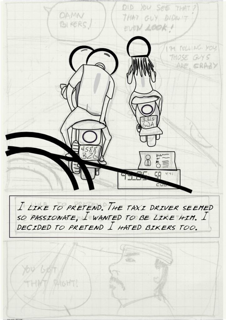
Today I went out of my way with the shading. Maybe I ended up being too artsy. I really like drawings that have that sketchy or somewhat careless shading, but I assume that too requires some practice...
Anyway, lo and behold, the new version, with panel 2 included and what could pass for dialog.
I also got tired of the previous Blog theme ("Bold Life"), so I'm back to this plain one that allows for more space to be used for content (update: changed my mind!)
(more...)Could this be my first panel? 10 Mar 2010
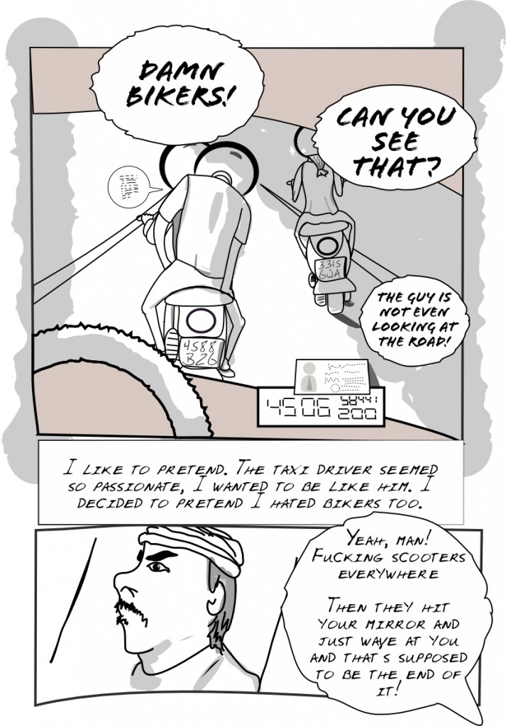
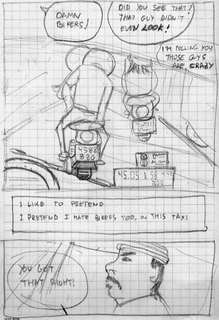
Well this page was intended to have just two panels, with a bit of dialogue. So, it seems I managed to finish panel one. I'm hesitating a lot about the amount of detail I want to put into it. For once, hands of the bikers fly but I wonder if it's actually worth doing the rest of the bike. The idea is that the reader should just read the balloons and essentially go quickly through the whole page. It looks maybe too schematic but I kind of like it... You can tell that this is my first panel with Inkscape. Will think and gather some input.
I came to the realization that I need to draw more accurate drafts by hand, because it's quite difficult to define shapes on-the-fly, I like the old man approach of 'inking' over an scan.
Oh, by popular request, girl-on-a-bike received a new hairdo and some more detail.
Fonts on balloons were changed too, but I kept the font for the narrator.
(more...)Getting there, slowly 08 Mar 2010
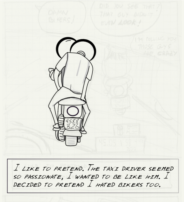
Well it takes a while to draw, but I think I'm starting to learn. I kind of finished the two bikes, handlebar pending, and I'm now playing with drawing what should pass for a wheel and something that should resemble a windshield effect. Let's see how that will go.
I'm posting my progress just for the fun of checking how it evolved later.
What's a good style...? 06 Mar 2010
Well I seem to have a clear idea of what I want to draw, and most importantly of what I want the story to tell and how it should look like. Problem is getting there is not as easy as one would want!
One thing I don't really like is, well, color. That's a pretty bold statement, I know.
The thing is I like some color, but just very basic lines, traces of it. That may or may not be linked to the fact that applying color is a real pain too, and that I lack any kind of talent to handle color.
So let's take my previous canvas, now with a bit more of inking and some test shades. I also added some color to the background. Something simple as this would work for me, I'm not a fan of details... I'd like to focus on the story (yeah, maybe I should be writing a book!). Anyway, I'll gather opinions.
By the way, I followed the best advice you can get when working with Inkscape: save often, save with different names, activate autosaving. It's fairly stable, but it still has a tendency to crash with certain operations and, worst, leave your file in a corrupt state.
(more...)A word on fonts 05 Mar 2010
Well typography is its own beast.
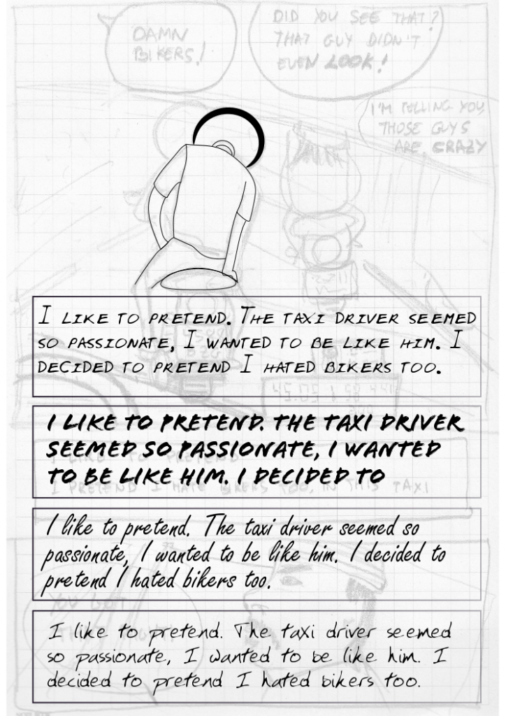
You may have noticed the fonts I used on one of my previous uploads. Somehow, those fonts seem too simple.
Of course, having yet to decide colors and overall the general look that the comic will have, it's probably too early to worry about fonts. But it's fun to play with them.
I tried a few (recommended to me by a real designer). From top to bottom, the fonts are: AlexsHand 36 points; Flood Std 36 points; Freestyle Script 48 points; YoungsHand 36 points. All 100% spacing.
At this stage I seem to prefer the first one, although I'll try all of them again when drawing the final page. By the way, it takes ages to ink...
(more...)The story 04 Mar 2010
Well, of course, drawing a comic without a story does not make that much sense. But, you see, I do have story. I won't post it yet because a) it's bound to change and b) it's not that good of a story.
So today's panel is part of the story. Problem is, my English will need some proofreading. I very much prefer not to type in any actual words unless it's within Inkscape, so that I can change them quickly and easily. Somehow, in this case I did write something on the panels, as a guide. Maybe I should just remove it before posting. But it's part of the fun, seeing where this will evolve, mutate.
Trying out the scanner 22 Feb 2010
Or... I can just doodle something on a piece of paper, scan it, then apply some ink on top of it, and see if that looks as a draft. Then, over that draft, I should create the final ink and add layers for shading.
