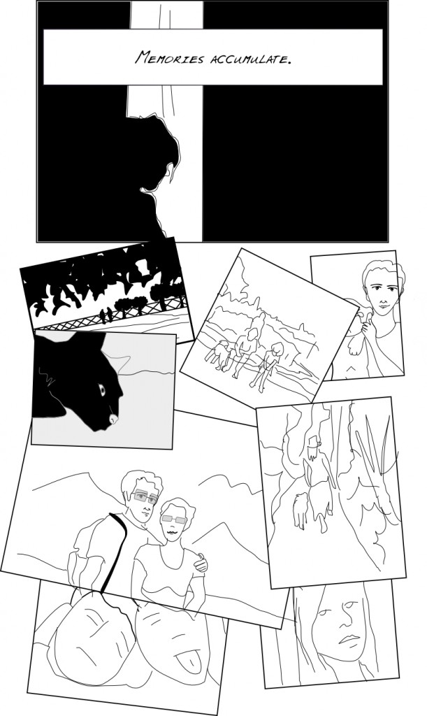
Blog: Aging 2010-05-15
I’m starting to think my story is a bit too ambitious given my current abilities :), but foolishness can get you quite far. Thing is, the story I’m trying to tell is supposed to go back and forth between three different ages of the main character. That means I need to be able to draw the character in three different stages of his life (as if it was not difficult enough to draw one character in more than one position!).
(more...)Blog: Wait, what was that? 2010-04-27
I knew from the very beginning that creating a webcomic imposes some restrictions. One is the immutability of content. Once it’s published, it shall not be changed. Thus spoke the Lord.
Now, add in the fact that you need to release periodically. Even more, you must. That’s actually the key point, if I ever learn to draw it will be thanks to being forced to do it :):
Thing is, I didn’t have enough time to review and check the last page I published. Then the next day, it felt completely out of tone with the idea of the comic. So I committed a sin and changed it and it’s very interesting to see that some people noticed, but of course most didn’t until I pointed them to the change (Facebook power).
(more...)Blog: Cherchez la femme 2010-04-21
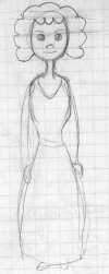
So I have this problem. Let’s come clean. I can’t draw women. I like to draw women in an androgynous way, I’m not too keen on drawing big voluptuous figures. Problem is, well, they are so androgynous that they are essentially indistinguishable from men.
So the solution is clear: add long hair, a ponytail or some earrings in order to provide clues, or combine it with a nice skirt. Women’s Rights defenders will campaign against me soon. All that is good but limits my spectrum and sort of makes my drawings too stereotypical. Take this sketch as an example, that could easily come from a fairy tale. And I’m not sure why I used the manga eyes on it, btw. Ok, I was in a plane so the pressure changes may have affected my brain.
(more...)Blog: On-the-go alternatives to scanners 2010-04-10
I’ve tried a few things that can replace a scanner. Let’s share.
Since I only use the scanner for sketches and basic character traits, I don’t really need that much precision but I do need it to be focused and not distorted.
-
iPhone photos. Crap. iPhone lacks a flash and is completely incapable of applying the right focus.
-
iSight camera from my rusty macbook. So-so, it has a pretend-flash and seems to be better at focusing, but it forces me to hold the paper at just the right distance.
(more...)
Blog: playing with proportions 2010-04-01
So I had a hard time choosing the right proportions for the character when he’s older. The child is supposed to be funnier and intentionally disproportionated but the adult, even if it should also look like a cartoon character, should be a bit more proportional. So I started googling and found various techniques, the one applied here is based on the size of the head, essentially using it as a ruler. See the progress from sketch to draft below. Essentially, the body is 7 ‘heads’ long. Trick is that whenever there’s a joint, these ‘heads’ may overlap as in the knees below. Well, that’s what I think…
(more...)Blog: Now I'm really missing the scanner 2010-03-31
This is what I did yesterday. I tried doodling directly with the tablet, bypassing the usual pencil drawing and then scanning, because I don’t have a scanner here. I did some basic hand drawing for inspiration, but changed it a bit when drawing on screen. The conclusion: I do need the scanner or drawing with a bigger zoom or something, because the results are quite disappointing:
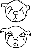
The thing is that unless you are a the correct zoom level, most of the traces you draw with the table are not actually represented in the drawing, so when I quickly did the traces for the head of a mouse (that’s what the child is supposed to be holding), all the detail disappeared. I’m posting it nonetheless, so that the world can see how that evolves to something :).
(more...)Blog: Drawing children 2010-03-29
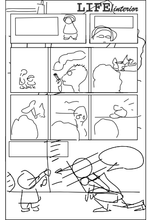
Well the next pages that hopefully will be coming during the following weeks are actually scripted, yes, like in a real comic! They describe our narrator’s recollections from his childhood. I wanted to use a slightly different style for the ‘childhood’ era. I included the actual drawing process this time. Since I don’t have my scanner here I didn’t use the pencil draft, although I did create one. So process goes: I outlined the figure with straight lines, then smoothed them using Inkscape, then tweaked them, then continued tweaking and defining detail (while trying not to put too much detail in).
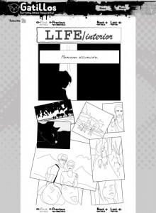
(more...)Well my friend Sergi was kind enough to draft a design for this site. His approach is usually quite different to mine so that’s always welcome.
Here’s what it looks like:
By the way, I enjoyed the UK Webcomix Thing 2010 today. Lots of talent there, I talked with quite a lot of people which were quite nice and I hope someday I myself will have something to show there too :). Lots of different styles, but I seem to prefer the somewhat cute ones, like Timothy Winchester, if only because of the business cards he was giving:
(more...)Site redesign... 2010-03-25
Well since I have some difficulties finding the right spot to draw, I’ll update the site putting it closer to the webcomic layout. I’m using a wordpress plugin called webcomic and the inkblot theme, no customizations yet.
I’ve been doing quite a lot of traveling lately (Dublin, London, Barcelona) and that’s seriously getting in the way, but I shall prevail!
Have defined the story and will start posting pages in an orderly manner, while also continuing with the blog. It’s part of the magic of the webcomic plugin.
(more...)More background story 2010-03-21
So I’m continuing with what could be thought of as the introduction. The narrator continues to present a bit of himself as a prelude to the story.
First panel is actually a rendition from a photograph from my friend Haripako (check it at his flickr page and take a look at the wonderful photographs he takes as part of his ongoing 365-day photo project, used here under permission :)). The rest are based on old photos I had around and some googling for inspiration.
(more...)